April 5, 2018
Chartreuse – A Blend of Yellow & Green
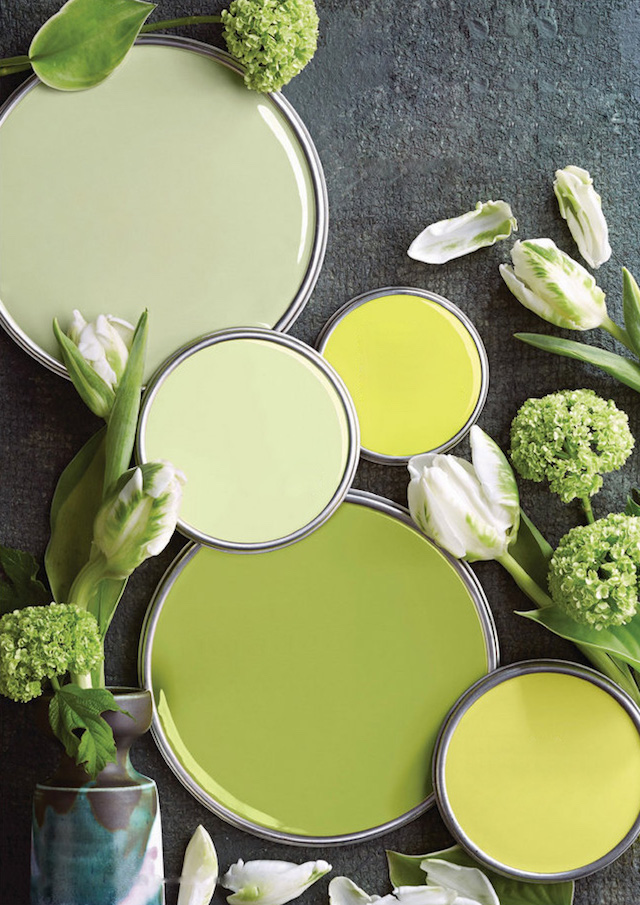
Usually known as chartreuse, yellow-green lies in between yellow and green on the color wheel; it is a perfectly balanced blend of both colors. The name Chartreuse came from a French liqueur of the same color produced by the Carthusian monks in the 1600’s. It is a bold and rebellious color by nature and its’ appeal as textiles for fashion and interior design has spanned from the mid 1800’s thru the psychedelic era to todays tech savvy interiors.
 This unique yellow-green exudes happiness and energy, it’s considered a motivating color. It is a great accent color and has the strength to take center stage. It pairs well with magenta, black, purple, teal, orange and grey. I wouldn’t hesitate to bring it in as my new spring punch! How refreshing.
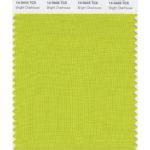
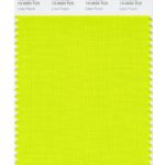 Bright yellow-greens take some of the attributes of yellow and evoke emotions of joy and cheeriness. Neon hues of this color are often more youthful as seen in clothing stores with a more preppy and fun vibe, such as Lilly Pulitzer or Vineyard Vines.
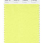 As a modern tone, this hue is similar to bright chartreuse, yet exhibits calmness. When first seeing this color, you might think of a Golden Delicious apple or the first breath of spring. In modern, industrial and sparse interiors, pairing this color with cool greys and sleek metals makes a fabulous complement.