January 10, 2018
2018 Color of the Year
Welcome to 2018!
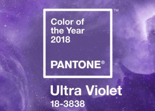
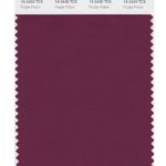
Pantone Color Institute has selected Pantone 18-3838 Ultra Violet as the 2018 Color of the Year.
The Pantone Color Institute is the global leader for color information, color forecasting and color development recognized around the world. Since it’s founding in 1963, Pantone has transformed how designers in graphics, fashion, home and interiors communicate color by creating an universal color language. This system specifies numerically the red of Pepsi versus the red of Coke. It defines the Tiffany blue exactly no matter if it is an advertisement or a beautiful little box.
What do we know about the color Purple?
We know Oprah Winfrey made a movie in 1985 called The Color Purple direct by Steven Spielberg which made her a star. But, there is so much more to know….Purple is the blending of Red and Blue, two of our three “Primary” colors; the third being yellow. The reality of these two colors are they both have definite personalities. Red, considered a warm color, is explosive, full of energy, while blue, considered a cool color, is calm and tranquil. Because these colors are so diametrically opposed, when mixed together, many people don’t know how to react to pure purple. For this reason, it is necessary to skew the shade to either a warm red purple or a cool blue purple for people to relate to the color.
With greater red tones, we perceive the color to be passionate, sensual, more exciting and dynamic. When we see cooler tones of blue we perceive it as more dignified and serene like the color of the year, ultra violet.
Ancient history tells us the color purple came from the Phoenician trading city of Tyre, modern day Lebanon, from the crushing of thousands of snail shells just to produce one ounce of dye. Being so rare and costly only the rulers could afford it. Through the centuries Purple has been associated with royalty, power, religion and wealth. In the Old Testament, there are many references to purple which became reminiscent of suffering, sacrifice and penance. Alexander the Great wore purple. Elizabeth I, Caesar and Nero proclaimed purple exclusively for the emperor or Royal family. Cleopatra may have been influenced by her good friend Caesar and hoisted only purple sails on her flagship.
In 1845 at the Royal College of Chemistry in London, William Henry Perkin, during an experiment mixed a chemical aniline with a form of potassium and stumbled upon a synthetic purple compound. Experimenting with the compound he discovered it dyed fabric beautifully, so he patented the dye and manufactured it, making purple accessible to everyone, not just the elite thus making a small fortune for himself.
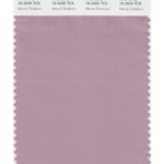 Mauve, though once an old fashioned color is becoming more gender neutral and less age-related, exudes sentimental and thoughtful emotions.
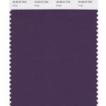 As the deeper tones of purple lean toward black, some cultures perceive the hue to be more mournful and melancholy while in others it’s considered more sophisticated.
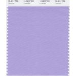
Lavender has always been considered romantic, nostalgic, old fashioned but as of late is gaining popularity by all genders and ages in merchandising, fashion and interiors.
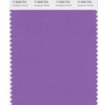
Amethyst exudes calm, balance and peace of mind. The name came from the stone found by the Ancient Greeks, Amethyst, which meant “not intoxicated”. It was said Dionysus, the god of wine, created the stone when he was pouring wine over a clear crystal.
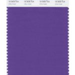 The color of 2018 is a blue purple and it empowers originality, ingenuity and visionary thinking. It lends itself to the mystical qualities of purple and the greater universe beyond.
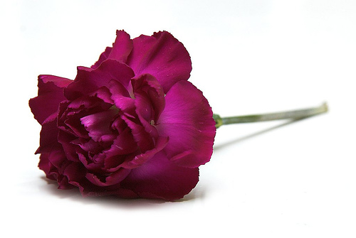
 Red purples are sensual, passionate, dramatic and they create energy; it’s what happens when you use the warm red with the cool blue; that combination causes excitement.
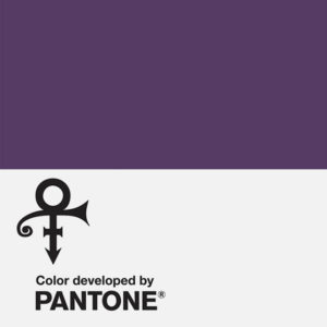
Pantone and Prince’s estate partner together to “create a custom purple called Love Symbol #2, a.k.a. the unpronounceable symbol he adopted as his name in 1993. The specific hue was taken from the custom purple Yamaha piano he was set to take with him on tour before he passed in April 2016.”
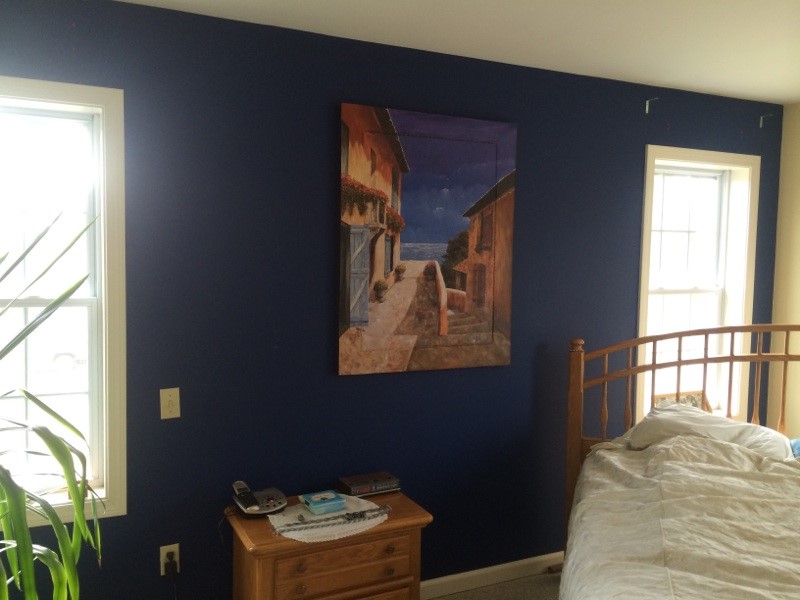
Using Purple in your interior can be very tricky. As we learned, purple has an energy with red undertones and is perceived more calming with blue undertones. When you tint it with white it becomes more romantic and when you shade it with black it becomes more sophisticated. I’ve used purple successfully in moderation as a paint color, meaning a deep blue purple accent wall flanked by warm yellows and golden woods, though not a great picture, you get the point. It created a very dramatic backdrop.
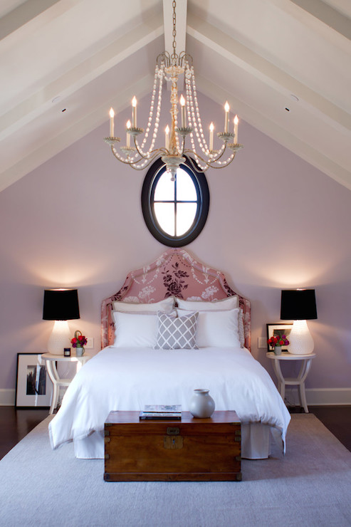
You can achieve drama by using the darker value in purple but I truly believe to make it successful it needs to have a serious balance of lighter hues or tones such as off white, light grey or a similar neutral.
If you’re looking for a more restful environment I wouldn’t hesitate to select a lavender, mauve or rose. You’ll love how it embraces peace and serenity.
 (Photo Credit: Décor Pad)